Monday, 21 November 2016
Monday, 14 November 2016
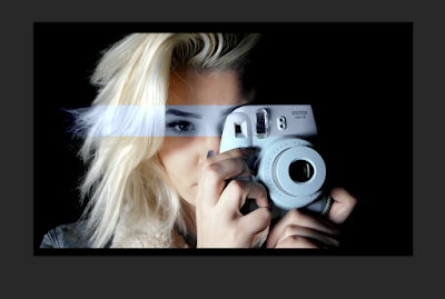
Final Advertisement

Final Digipak

Sunday, 13 November 2016
Editing my production
Due to having previously editing a film opening production and various other films, editing my music video came as second nature. I didn't experience problems within the editing stages of my production. However, below i explain the overall process of editing my raw footage into my final product.


After watching all my raw footage and deciding which was the most effective and best shots to use to conform my general idea of my narrative, I edited the shot into a sequence. By doing this I am giving myself a structure to work from, a foundation which I can then change and build upon.

Next, I added the soundtrack which I am going to be using for my music video, this can allows me to change my shots syncing them up to either be non-diegetic or diegetic to the soundtrack. This is the simplest way, in my opinion, to edit footage as it gives the editor a clear plan on which direction the final product is heading.

Once, I was finished moving around my basic shots and footage into the sequence parallel or contrapuntal from the soundtrack- i begin to layer up my shots, for a more professional and complex feel to my final product. Overlaying the shots took most the time, as I wanted their to be a symbolic connotation and connection between the shots and the soundtrack making them parallel and synchronous to the images.

By overlaying the shots, it mean't that the shot underneath was invisible, therefore to ensure that both shots can be denoted in one scene I decreased the opacity of the overlaying shot. After doing this i am able transform and move the overlaying shot, moving it into a place where both shots are visible. This is a simple and professional looking technique when creating any production, however, must make sure not to go overboard with this effect as the audience won't be able to tell the shots apart and will only cause negative confusion.

Having overlaid shots throughout the duration of my production, may bore my target audience. Therefore, in terms of post-production, a good way to break down and change my production is to add different effects to certain shots- keeping my demographic engaged throughout. For certain parts of my production I made the choice to slow down certain shots. By doing so i'm creating and connoting the effect of slowly down time, this technique works perfectly for my music video as the lyrics are very slow, therefore the slow shot is able to be synchronous to the music.

As, another technique to break up the shots. I wanted to divide my footage into present and past. Allowing my audience to encode a sense of memory against the reality. Therefore I decided to use a handheld camera technique in order to film the shots- where they are signified as self made memories that audience are now being brought into and shared with. To ensure that my demographic make this division, in post-production, I have also added a black and white effect over the shot- where the change in colour, presents and connote a change in time. My target audience will be able to make the like that the footage is the past and not the future, as black and white effects symbolise and connote the past, where the brain immediately remembers in human history colour TV wasn't a thing. This also signifies how old the shots are.

For all my shots, I turned the volume down to 0 in order to ensure that only my lyrical soundtrack would be heard.

Lastly, towards the end of my production, I added a fade in between certain shots. This happens at certain point of my non-diegetic soundtrack, in order to act eyes closing from scene to scene; parallel with the slow dips of the pace in the soundtrack. By slowly introducing these brief fades throughout the ending of my production acts as iconography for the ending- where they are setting up the audience and foreshadowing the near ending of my music video.

The last step to editing my production was to take one final check of all my work, ensuring that is conforming my needs and up to the best standards before exporting my final piece. To do this final check, I just played through my production viewing it from beginning to end a couple a times, watching carefully at each shot.
Friday, 11 November 2016
Intertextuality in Music Videos
What is Intertextuality in music videos?
Intertextuality is when a text references to a different separate text within itself. Literary Critic, Julia Kristeva, states that within her critical analysis and cultural theory, her work addresses intertextuality as 'The shaping of texts' meanings by other texts' of which 'any text is the absorption and transformation of another'. This 'absorption' of other texts (including; film, art etc) within a music video is known as an intertextual reference; a popular convention of a music video and normally goes by unnoticed, however there are a few music videos that portray this explicitly.
 One example of intertextuality in music videos, is Madonna's pop video for 'Vogue', despite the obvious reference to the popular fashion magazine within the title, the video makes reference both to Marilyn Monroe. This is denoted through the visual appearance of Madonna, she can be inferred and denoted wearing a low neck and a white dress. This white dress relates to Monroe's iconic and famous white dress, in addition to both having blonde curly hair, flawless skin and bold lips. The pose of which the artist is also standing in also signifies the ideology of being on a vogue cover. This of which in parallel with the title, conforms to the suggestion and connotation of 'Vogue' being an intertextual reference in her music video. The monochrome tone of the music video throughout, connotes to the ideology of being captured in time, this conform the ideology of elements of monroe, as she was an iconic character in the media that is now captured in time; a timeless celebrity. With this connotation in mind this further signifies Madonna's want and desire to become or how she views herself as a timeless celeb.
 Another example of intertextuality in music videos is, Taylor Swift's 'Love Story', which has strong intertextual references to iconic love stories and fairy tales. These love stories and fairy tales including; Romeo and Juliet and Rapunzel, referenced highly through the periodic costumes and such 'fantasy' and 'enchanted' locations such as the woods or a castle. Through the lyrics themselves there is a strong reference to love stories, 'pulled out a ring and said marry me Juliet'- conforming and making the visual reference all the more synchronous. This conforms the conventional 'relationship between visuals and lyrics'. These certain love stories are globally known. Therefore universally the world are able to understand and relate to the intertextual reference as the tales aren't restricted to one society or country. By making this intertextual reference Taylor becomes a marketing technique for the timeless stories of Romeo and Juliet and the film developed from the story. However, this reference also benefits the artist as she becomes iconography for Romeo and Juliet, marketing her music, the demographic will remember her song, 'Love Story' featuring this reference when reminded of Romeo and Juliet. This ultimately will grow her target audience from niche to a mass.
As my production is of a modern day love story, my music video and narrative works and plays on the idea of different elements of love stories. Like Romeo and Juliet the element of love and enjoying each other company is a conventional hegemonic reading throughout my production. However there are intertextual references to drama film (directed by Nick Cassavetes) The Notebook, in the sense of a normal love relationship going through a hardship or difficult time. However, to subvert the conventional love of a hetrosexual relationship by music video, exposes the fights and the negative side of the love; a side which mainstream media fail to express.
Methodology presentation
My Methodology presentation:
My methodology presentation included different aspects such as, filming and editing processes and planning stages of both my production itself and the production of my poster and digipak. The point of my presentation was to show the audience of my focus group, how I got to my final outcome. I also adding a slide explaining the drawbacks of my production and how i over came them. This this shown below:
Focus Group by jessicapeaty on Scribd
Focus Group by jessicapeaty on Scribd

Above is an photo of my feedback questionnaire that I will be asking my focus group to complete.
Thursday, 10 November 2016
Advertisement Refinement

After having my image edited on photoshop for my poster, I began to work and develop my font for my advertisement. Above portrays my first draft where I start to think about the font in comparison to my advertisement.
Saturday, 5 November 2016
Editing my Digipak
Editing my digipak was a very different process to my poster. I used both photoshop and be funky (two photo editing systems) in order to create my digipak. I edited each six sections separately. Below i demonstrate a few of the digipaks and how i edited them to create my final piece. 9ikm


As documented above, I used Keynote (Apple's equivalent to powerpoint) to develop the structure of my album cover. Starting with a plain black background, i took the pen tool, and created a straight lined heart structure. This structure denotes a heart, but the edgy feel of the shape symbolises and connotes as an carving- conforming a new outline of the stereotypical carving into a tree. To juxtapose this previous ideology, instead of the names of my characters, the name of the album is in the centre. By not having the names of my characters in the centre of the shape- I am representing my characters as a couple, as the ideology of the everyman. Iconography for realistic relationships.

Once saved I opened the photograph in photoshop, I added the element of the moon, changing the colour to darken the the moon- subverting the hegemonic reading of the moon and bringing reality to the darkness of the night. This connotes and symbolises the counter type of the love expressed within the song and relationship. I copied and mirror the heart, adding a ripple effect as reflection of the moon. The strong structure of the moon, symbolises the good and positiveness of the relationship, whereas the distorted reflection portrays and signifies the opposite and the negativity- showcasing both ends of a relationship. Creating a counter type.

Above is the photograph i decided to add over my front page in order to create more dimensions to the photo. I wanted my artist to be added into my work, however i didn't want her to be the main focus of my work- keeping the element of enigma (conforming to Barthe's theory of the enigma code) within the poster.

The photo donated above, is edited on photoshop. The photo of the swan was cut out, and placed over a black background; i then copied and mirrored the swans against each other and then again to create this mirror reflection look. Before mirroring the swam i puppet transformed the photo, in order to create the connotation and illusion that the swans are touching creating the heart shape. As swans are a symbolic reference and connotation to romance the heart shape in between them helps signifies this ideology. After this to get to my final product i created a quote from the music video production lyrics. Expressing and encoding to my target audience the further connotations of love and the symbolising the key song on the album.
The other digipaks and final productions can be viewed on my draft of digipaks posted previously.
Editing my Advertisement
To edit my first and second draft of my advertisement i used, photoshop.
Below is the photo before any editing took place, as i am working solo on my project as well as being the artist, I decided to film this shot and then screenshot the photo afterwards in post-production; therefore the photo is still my work.


Below is the photo before any editing took place, as i am working solo on my project as well as being the artist, I decided to film this shot and then screenshot the photo afterwards in post-production; therefore the photo is still my work.

After opening in photoshop I saved many different versions of the same photo in a variety of colours and tones on the photos. For example the photo added below is a blue hue, after I have developed a group of photos ranging of different colours, I took the, square box tool and as shown below, draw a square over the portion of my photo. After creating the square mask, i changed my tool to the move tool indicated at the top of the tool screen; and dragged the square (taking the portion of photo with it) into a different tab of photoshop that consisted of the original photo, that denoted above. I

As shown below, I overlaid the blue square portion to my original photo. After over laying the photo, I faded the photo layer from 100% to 50% in order to allow the layers to blend together, for an ironically more realistic and flowing look. I repeated this process, a different of times with a variety of different colours and portions of the face to develop a mixed media effect.

As i made two versions of the same photo, I wanted to experiment with the layout of the photograph/poster. Taking each layer coloured blocks covering my artist's face, I added the filter of a ripple; sparking enigma to my artist and her production. This ripple, causes the face to become out of focus where her identity isn't the important factor I am trying to encode and decode to my target audience, it is the music behind the photograph and persona. Conforming to previous ideology of the representation of my artist, and how she is viewed as an ideology (relating to Richard's Star theory).

Representation of the characters in my production
As in my production I only have two characters, i creatively developed the characters to have polysemic meanings and views. Both subverting and conforming to hegemonic representations.
Firstly, the female character, is denoted as the artist, through the performance shots. She conforms to the hegemonic readings of a stereotypical woman, through her use of being sad when a male isn't present on scene. She also conforms to hegemonic reading when she's she's fighting with the male present. This connotes her as a annoying problem-maker, conforming to the stereotype of females. The boy on the other hand, is only denoted when with the female, as more shots are different to the female, it connotes her importance. This subverts Laura Mulvey's theory where female's roles are sidelined. Within the ending fight, of the production, the male is denoted standing up and walking out of the room, this conforms to the common stereotype of males; that they just walk away when things get hard. As a couple the characters represent and expose the reality within a relationship. This subverts hegemonic readings of relationships in the media, creating a countertype. This causes my artist to become an ideology, that she's expressing and decoding the reality of a relationship- this conforms to Richard Star's theory of artist, where the artist becomes an ideology. Even though the relationship is connoted to have negative times, they also for the majority have a positive vibe throughout the production- this captures both sides of a relationship. This subverts the hegemonic one, side that of positivity the media dominantly only portrays to their audience. By having this reality of relationships, my artist's target audience look up to her, in a realistic way, where they feel their relationship is normal, rather than having to be in a relationship that has no arguments or conflicts what so ever; this is impossible and only makes situations worsen.
Firstly, the female character, is denoted as the artist, through the performance shots. She conforms to the hegemonic readings of a stereotypical woman, through her use of being sad when a male isn't present on scene. She also conforms to hegemonic reading when she's she's fighting with the male present. This connotes her as a annoying problem-maker, conforming to the stereotype of females. The boy on the other hand, is only denoted when with the female, as more shots are different to the female, it connotes her importance. This subverts Laura Mulvey's theory where female's roles are sidelined. Within the ending fight, of the production, the male is denoted standing up and walking out of the room, this conforms to the common stereotype of males; that they just walk away when things get hard. As a couple the characters represent and expose the reality within a relationship. This subverts hegemonic readings of relationships in the media, creating a countertype. This causes my artist to become an ideology, that she's expressing and decoding the reality of a relationship- this conforms to Richard Star's theory of artist, where the artist becomes an ideology. Even though the relationship is connoted to have negative times, they also for the majority have a positive vibe throughout the production- this captures both sides of a relationship. This subverts the hegemonic one, side that of positivity the media dominantly only portrays to their audience. By having this reality of relationships, my artist's target audience look up to her, in a realistic way, where they feel their relationship is normal, rather than having to be in a relationship that has no arguments or conflicts what so ever; this is impossible and only makes situations worsen.
Thursday, 3 November 2016
Advertisement Refinement
After feedback from peers, I decided to take my advertisement production down a different route. Using; Tyler Spangler and his use of mixed media as inspiration i made my own version and made improvements on my poster. Images will be shown below;
 |
| Version 1 |
 |
| Version 2 |
Subscribe to:
Posts (Atom)